SEEK Learning - Course Reviews project
(2018)
Project team:
1x UX Lead
1x UX designer (myself)
1x UX researcher
My roles:
▶ UX Design
▶ UX Research Moderation
▶ Visual Design
(2018)
Project team:
1x UX Lead
1x UX designer (myself)
1x UX researcher
My roles:
▶ UX Design
▶ UX Research Moderation
▶ Visual Design
Overview
Choosing a course on SEEK Learning and committing to an education provider can be daunting for prospective students. We hypothesised that by adding a course reviews feature to the site, we could help users to not only inspect a course but hear what other students have said about it.
In order to do this we needed to work out how we would collect reviews of the courses we had, and how we would present them in a way that was clear and easy to understand.
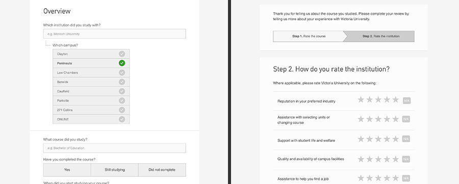
Designing the survey
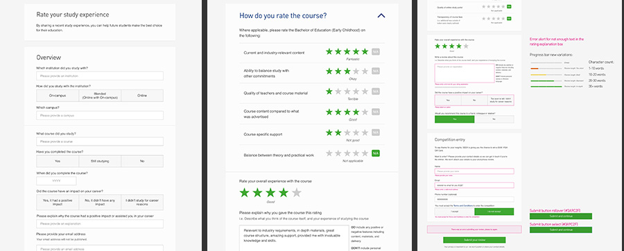
Iterating on the survey design
The survey went through several iterations before we came to a solution that we were happy with. There were concerns around the length of the survey potentially causing a low completion rate so we simplified the design to a single page, asking users questions that focused around what course they were studying or had completed, and cutting out any unnecessary questions.When it was at a stage that everybody was happy with we prepared a series of email sendouts asking SEEK users to fill out the survey, and prepare for the responses to roll in.
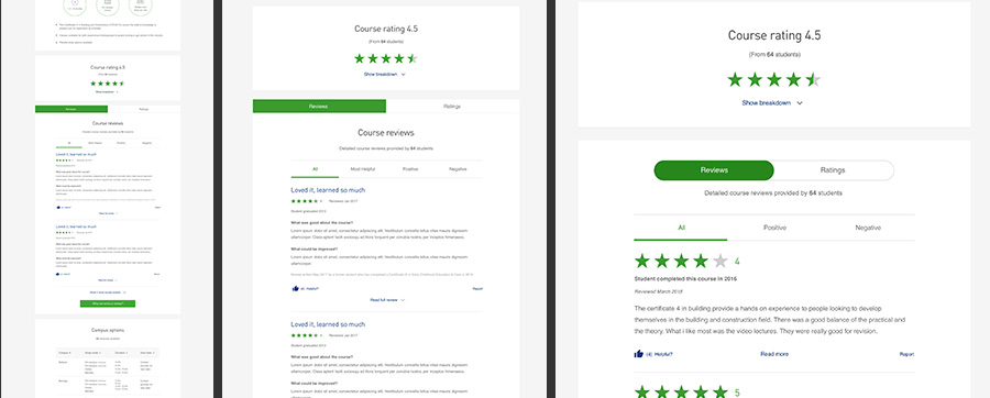
Designing the reviews component
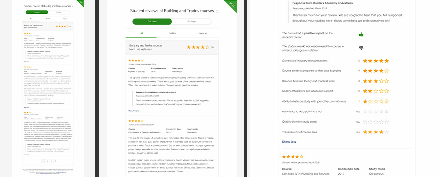
When the survey was finalised we began work on designing the course reviews component. Each review the survey was collecting was comprised of a written review a series of ratings, the reviews component would need to show all this data in a way that was useful to users and easy to understand. With the designs complete our developers started building them out, and started adding our collected data into them.
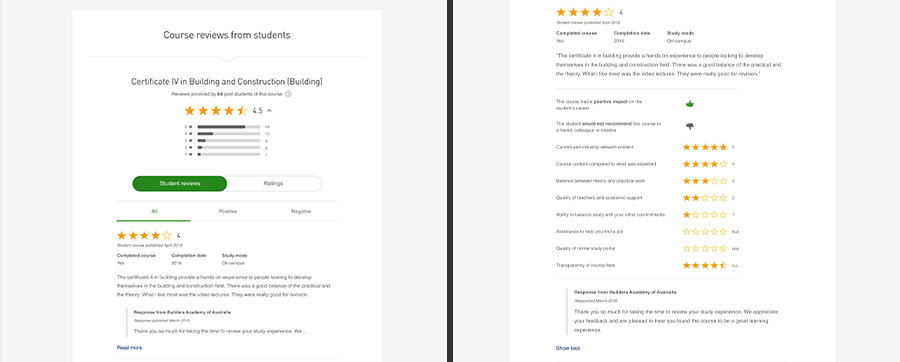
Iterating on the reviews component
When the live survey data was added to the reviews component we started noticing that the survey data came with some challenges, with certain courses listed on our site not getting many reviews (if any). There were also issues with how usable some of the reviews were, with our developers having to work to clean up the data and make sure they were matched to the right courses. This caused delays in how many reviews we could show on the site.We worked to resolve these challenges by iterating on the review designs to cover for these situations, making designs for courses with one review or none at all, and using the time as an opportunity to further simplify the design of the reviews component.
Once the data and the designs were sorted out we launched the component live on the site, and now are able to offer users with better insights before they commit to a course or provider.
Outcomes and learnings
This was a very challenging project early on in my shift to UX, so there were a lot of hard lessons learned. I learned that rough wireframing can be a huge help in saving time when working on a rapidly changing project, rather than reiterating a design over and over again.
Also a lot more thinking up front is needed when considering complicated scenarios such as what data you will be working with, also for coming up with contingencies early for scenarios when you might not have anything to show.
While this was a tough project it was definitely something I learned a lot from, and it helped me become a better UX designer.