NOTE: This case study was created in 2020 purely as a personal design exercise, this work is in no way affiliated with Arc System Works.
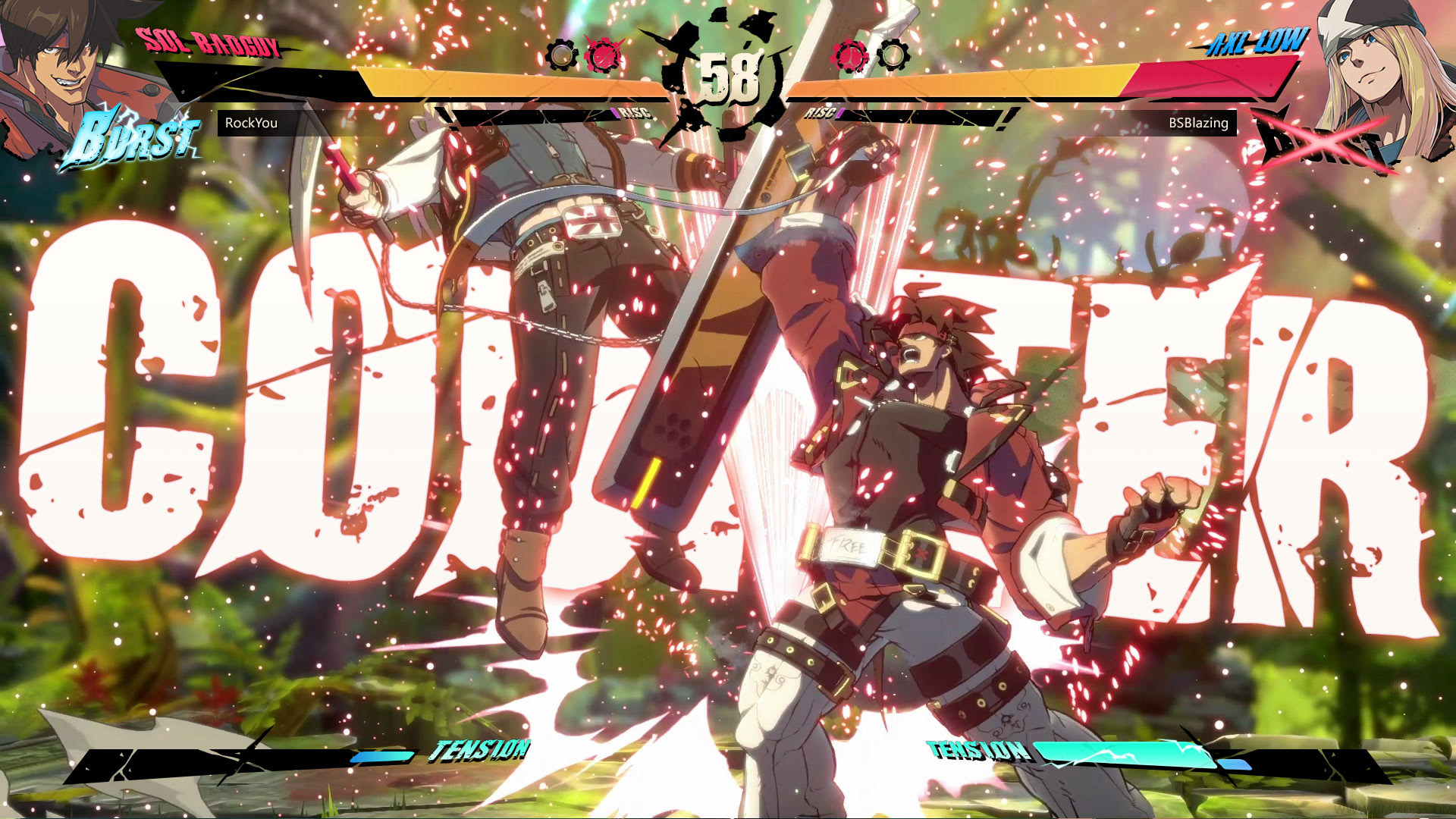
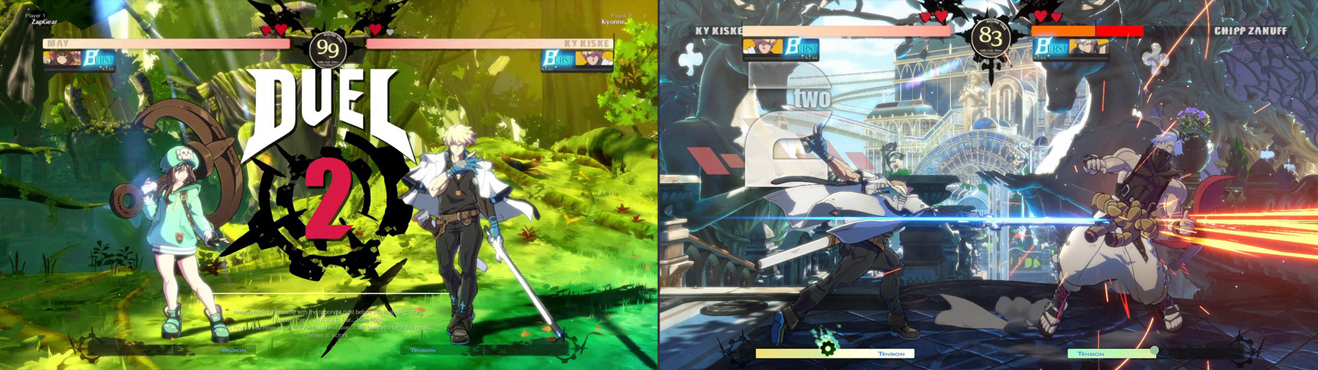
Guilty Gear Strive is the fourth main title in the Guilty Gear fighting game series. Guilty Gear is known for it's flashy action and rock music, however new the visual design of Guilty Gear Strive has had mixed responses fom players.
Guilty Gear Strive is the fourth main title in the Guilty Gear fighting game series. Guilty Gear is known for it's flashy action and rock music, however new the visual design of Guilty Gear Strive has had mixed responses fom players.
While the visual design of the game's UI has drawn critism from fans over it's tonal shift from metal to clean and simple, it is the usability of the UI itself has been a more common complaint.
The goal of this case study is to improve upon the usability issues found in the gameplay UI of the Guilty Gear Strive beta. I also intend to offer a new take on the visual design of the gameplay UI, one that echoes the Rock & Roll attitude of the previous games in the series, while staying true to the clean and fresh aesthetic the developers were aiming for with this title.
PLANNING AND WIREFRAMING
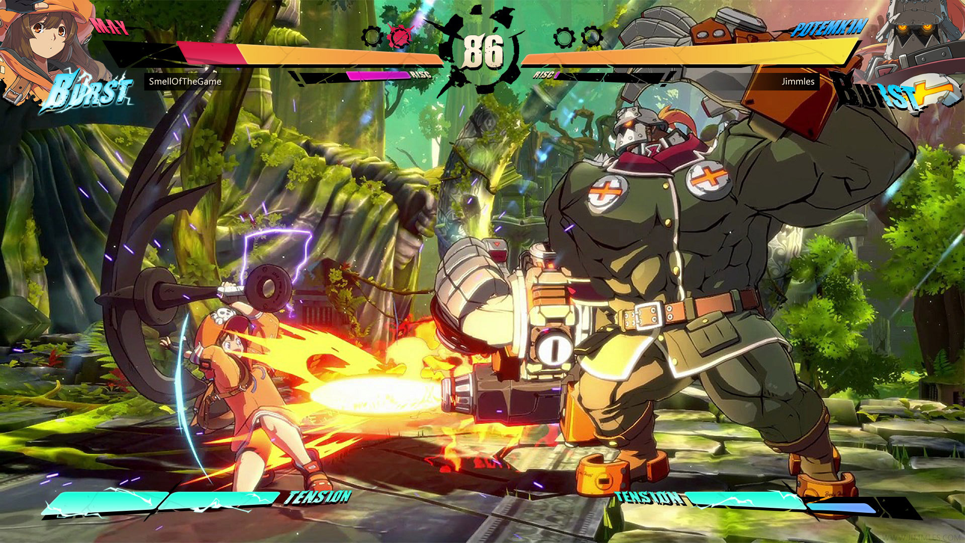
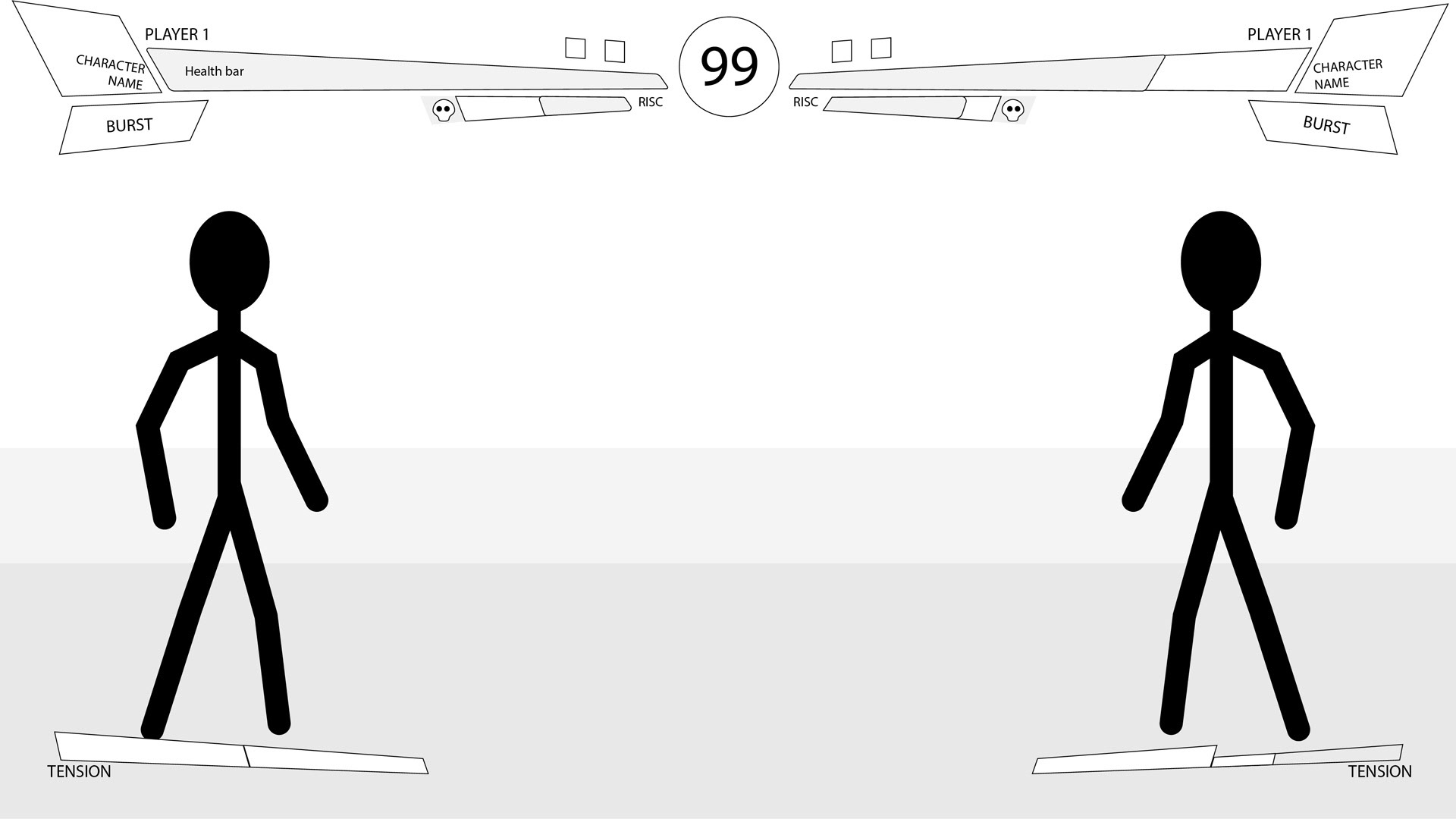
Before I started wireframing I studied the UI of the beta and identifies the key opportunities to improve it's usability.
I designed the wireframes to provide solutions to the following opportunities:
The character profiles move with the health bar, which could potentially obstruct parts of the gameplay screen
The 'Burst' and 'R!SC' meters are attached to the character profile, as the profile position moves with the health bar the position of the meters are always moving, and thus require a moment for the user to locate in a fight
The 'R!SC' meter is very small and hard to read at a glance
The two halves of the 'Tension' meter are not clearly differentiated
Player names are not prominent in the UI's visual heirarchy, and are easy to overlook
Round icons indicate how many rounds have been lost. Reversing the existing design pattern
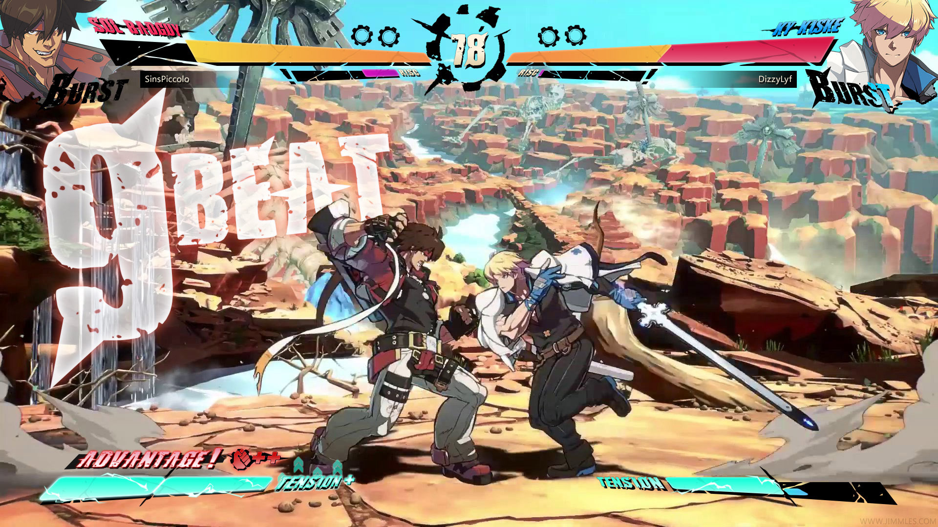
After a wall-break occurs, a 'Positive' alert is shown, with no explanation of that that means
The 'Burst' and 'R!SC' meters are attached to the character profile, as the profile position moves with the health bar the position of the meters are always moving, and thus require a moment for the user to locate in a fight
The 'R!SC' meter is very small and hard to read at a glance
The two halves of the 'Tension' meter are not clearly differentiated
Player names are not prominent in the UI's visual heirarchy, and are easy to overlook
Round icons indicate how many rounds have been lost. Reversing the existing design pattern
After a wall-break occurs, a 'Positive' alert is shown, with no explanation of that that means
UI DESIGN
Once the wireframes were completed I worked on the visual design of the gameplay UI.
My approach was to maintain the clean visual design that the beta's UI featured, however drawing on other elements of the game's aesthetic to give it a bit of a rougher and edgier flavour. I also worked to make gauges and player names more prominent and easier to read, allowing players in the middle of a fight the chance to get the information they need quickly with a single glance.
In addition to the visual design I renamed the 'Positive' status to 'Advantage', and added icons to clearly communicate to the player what buffs that are being applied in this situation. (In this example the player is given a damage boost, and the tension meter fills quicker)